Y-Labs Ventures

Bringing the core experiences of the physical classroom into remote learning

Background

As part of my Springboard Industry Design Project, I was paired up with a small team of Springboard students and Y-Labs Ventures designers. During our 5 week journey, we worked from scratch, starting with the research process and making it through some user testing. This is the result of an ongoing project, which will be picked up by Y-Labs and their new designers.

Problem

Due to the COVID-19 pandemic, most students have been forced to study remotely in 2020. The limitations associated with such a change are redefining the landscape of education. Bedrooms have become lecture halls, dining rooms libraries, and online video calls the new study sessions.


Solution

By fostering collaborative learning while keeping the remote environment in mind, we designed Y-Labs, a social learning platform that brings the core experiences of a physical learning environment into the virtual classroom.


Team

Product Designers

Alexandria Lo, Akhila Bashaboina, Emma Petersen


Design Consultant

Maddie Golbaz


Co-founder

Michael Olorunninwo


Duration

Dec 2020 - Jan 2021
(5 weeks)


Tools

Figma, Invision, Notion, Miro

Design & Solution Overview

Y-Labs brings all the applications students use into one place so students don’t have to use multiple programs to keep track of their work. Furthermore, it improves the overall learning experience to adapt to the pitfalls of online learning, such as distractions and lack of personal connections between students and teachers.

Live Classroom (This portion was done by Emma!)

Like standard video chatting, students and teachers will be able to see the teacher and each other. Along with the option to chat, students can take notes while the lecture is ongoing. Notes can be popped out, resized, and moved around the page at the student’s convenience. They are automatically saved into the Y-Labs Library, but students can also manually save them as a local document or in a select folder in Y-Labs.

During class, Notifications and the Community tab are disabled to minimize distractions. If the student navigates to another page, the screen pops out in picture-in-picture mode.


Community (This portion was done by me!)

If, for any reason, a student misses their regular teacher’s office hours or they want to get another teacher’s feedback, they can schedule a meeting with teachers who also teach the subject.

In the Student Lounge, students can join or create a room where they can chat with each other, voice, or video call. Bonding opportunities and fun are created through options to play suggested games, watch videos, or listen to music together.

Study Groups function similarly to the Lounge but without the bonding options. This way, students can minimize distractions and focus more on their studies.

Both the Student Lounge and Study Groups encourage students to invite each other but limit the amount of users who can join.

Students can also bond by creating and participating in events. Because of current affairs, students can only create online events at this moment.


Library (This portion was done by Akhila!)

The library is the place where students can find their books, add documents, and view recorded lectures.

While viewing recorded lectures, students can take notes like they would in Live Classroom and send a message to the teacher if they need clarification. The “Clip” feature allows students to precisely select segments of the lecture they want to highlight and send to the teacher to review.


Calendar (This portion was done by Emma!)

Class times, invited and registered events, and scheduled teacher meetings are all shown in the Calendar tab. Students can add in their own personal events, such as timed study sessions, reminders, and appointments.


Establishing The Foundation

How did we begin?

During our first few sessions talking to the co-founder, Michael, we discovered that Y-Labs already had a design. However, their designer recently left the company, and Y-Labs was left with an unfinished product that didn’t fully suit the company’s needs. That’s when we came onboard.

Michael gave us creative freedom over the project. His only requirements were:

  1. Come up with a design for both students and teachers
  2. Have 7 essential pages to the product: a dashboard, live classroom, community, programs, library, calendar, and profile

After establishing our design constraints, we dived into user research.

But we ran into a problem...

Our initial plan was to create a platform for both students and teachers to use. However, as we were conducting our interviews during the early stages of the project, we realized we were going to run into a major problem — the project scope would require much more time than we were allotted.

After a quick decision-making meeting, we stuck with creating the student view for the platform and focusing on the identity-defining pages of the platform, excluding the Dashboard.

Research

What do our users need?

We had two hypotheses:

  1. Students learning remotely are not as engaged as students learning in-person
  2. Students do not connect with their classmates and teachers at the same level or at the same frequency as they do in-person

We spoke to 7 students about their day-to-day challenges with online learning. We sought out target users: students in middle school and high school.

Interview insights:
  1. Students have a difficult time staying engaged when learning at home. Unlike in a comfortable learning environment, there can be many distractions in their home, like their mobile devices or other family members.
  2. Teachers are not easy to connect with. Some students mentioned that they were afraid of talking to their teachers about topics other than their assignments.
  3. It is harder to make friends. In a physical environment, interaction occurs naturally, whether it be in or out of class. Teachers try to maximize learning time while teaching remotely, which, in turn, takes away social time for students to interact with each other.
  4. Students use a variety of programs to enhance their learning experience. Google Classroom, Canvas, Flipgrid, and Pronto, just to name a few.

Overall, we found that the 7 pages would work well with what the students needed.

We created user stories out of the affinity maps to prioritize features and goals. These were some of the user stories we came up with:

What are our competitors doing?

At the same time, we looked at existing products that students used in class. Because students used a variety of programs during their online learning experience, we wanted students to feel familiar with the platform they’re using. Therefore, we conducted a competitor analysis on a mix of teaching tools.

Competitor analysis key takeaways:
  1. Users tend to like more familiar interfaces or those that have familiar elements (e.g. Google Classroom and Blackboard). Emulating the familiar and aligning with existing mental models can be an advantage
  2. A platform with many features can lead to visual clutter and confusion regarding navigation and how interface elements are used, which is what we have to be careful with when designing Y-Labs
  3. The ability to upload many types of media and customize assignments and activities was an advantage for teachers that aids in engagement

Ideate & Design

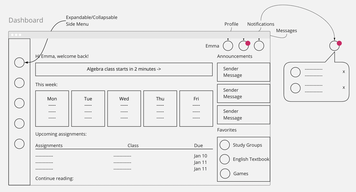
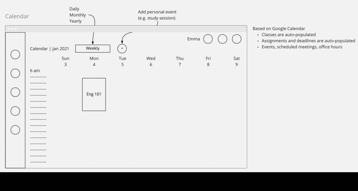
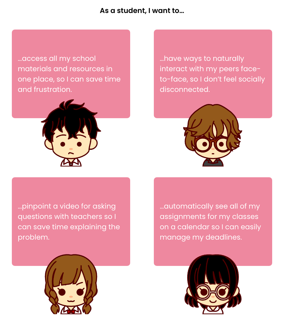
With three designers, we determined the four most critical pages to design from the user stories we gathered: live classroom, library, community, and calendar. Over a course of a couple of brainstorming sessions, we created user flows for each user story.

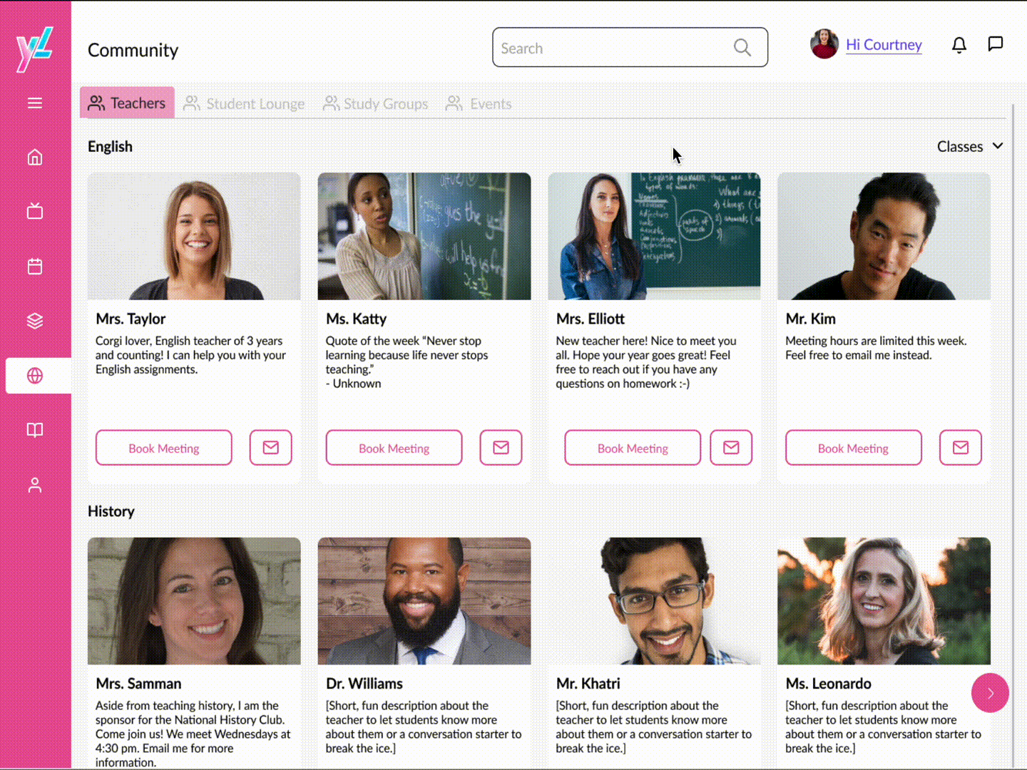
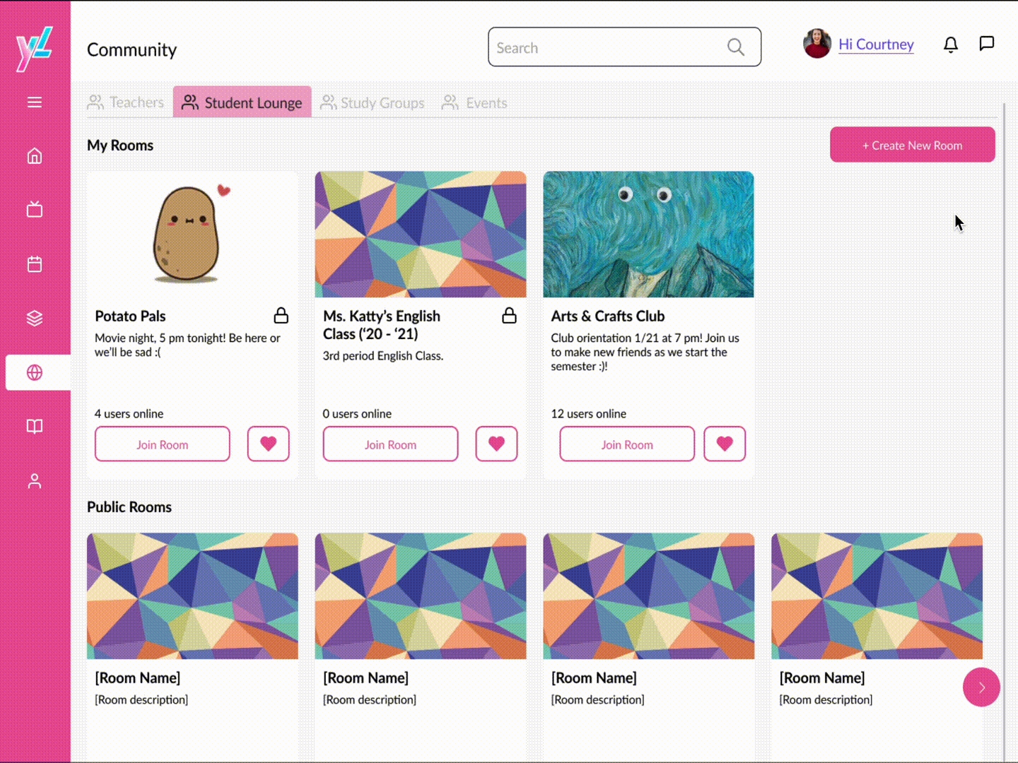
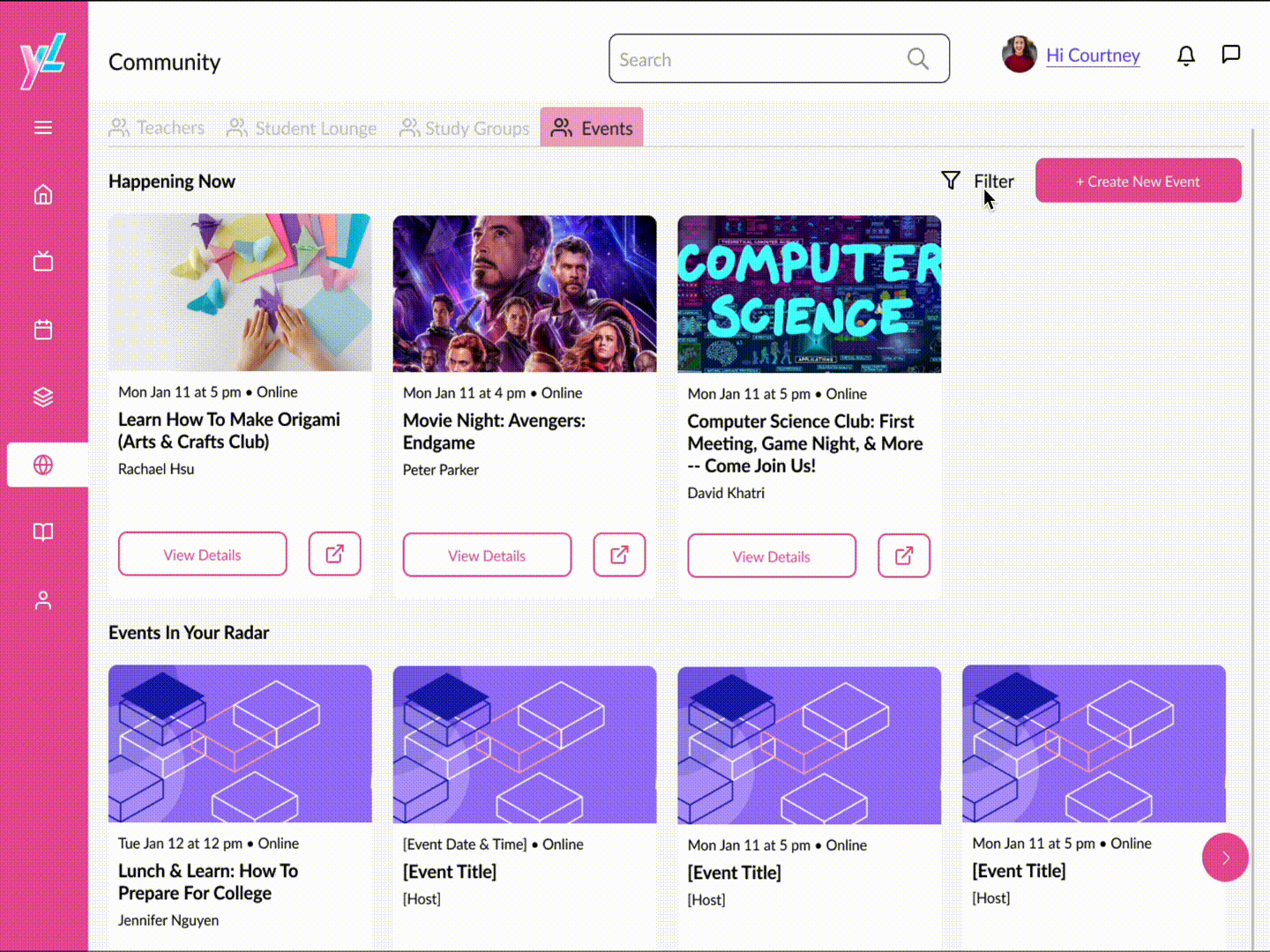
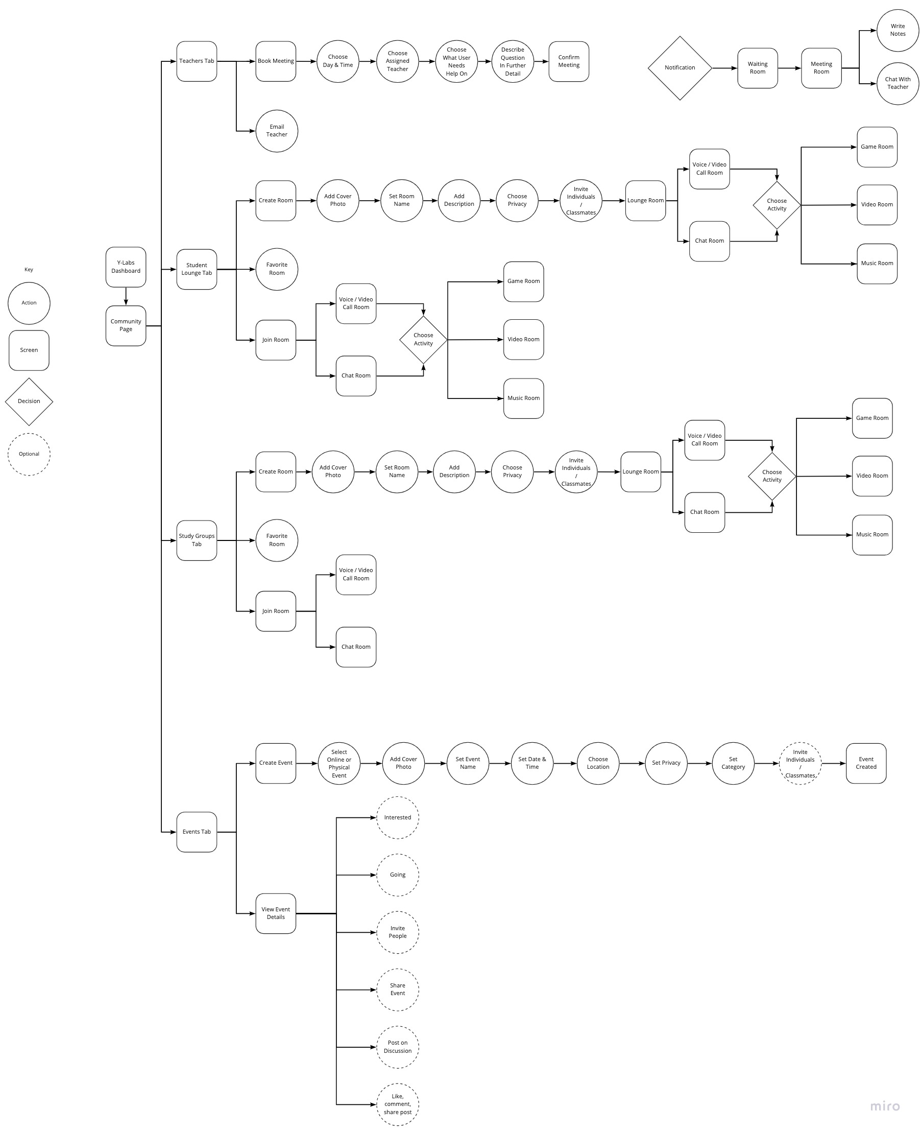
A user flow we did for the Community page.

To maximize efficiency, we split the work among us, and circled back during each meeting to unify our designs, ensuring that our designs stayed consistent.

Since we were unable to gather participants in a short amount of time, we checked in with the consultant and co-founder daily for a week to work from low-fidelity to high-fidelity to ensure our design stayed true to our goals.

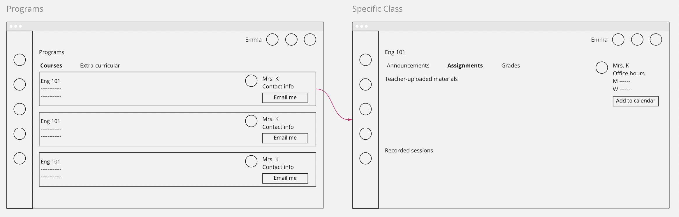
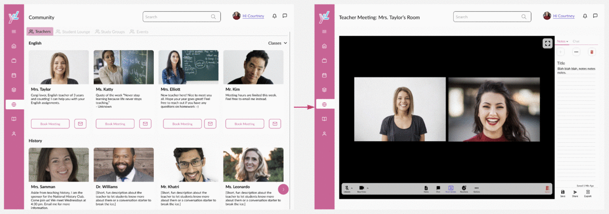
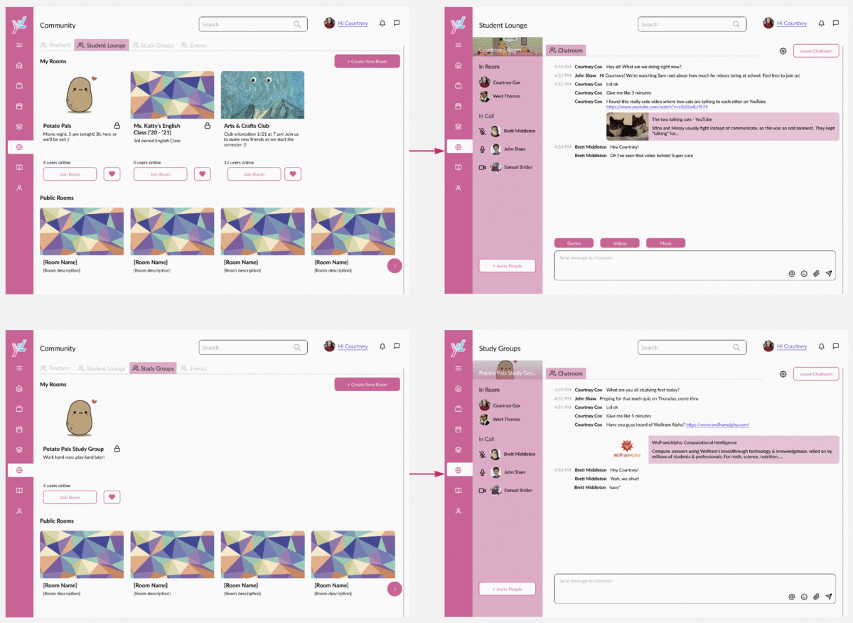
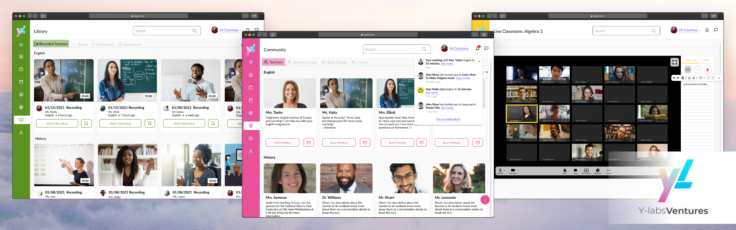
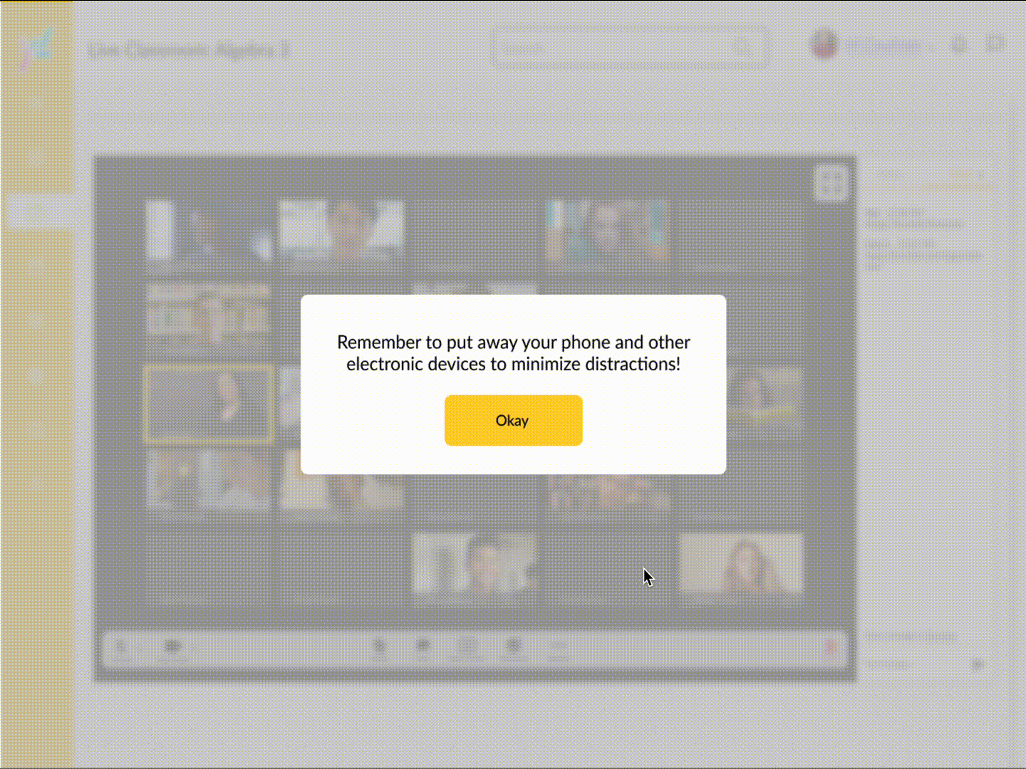
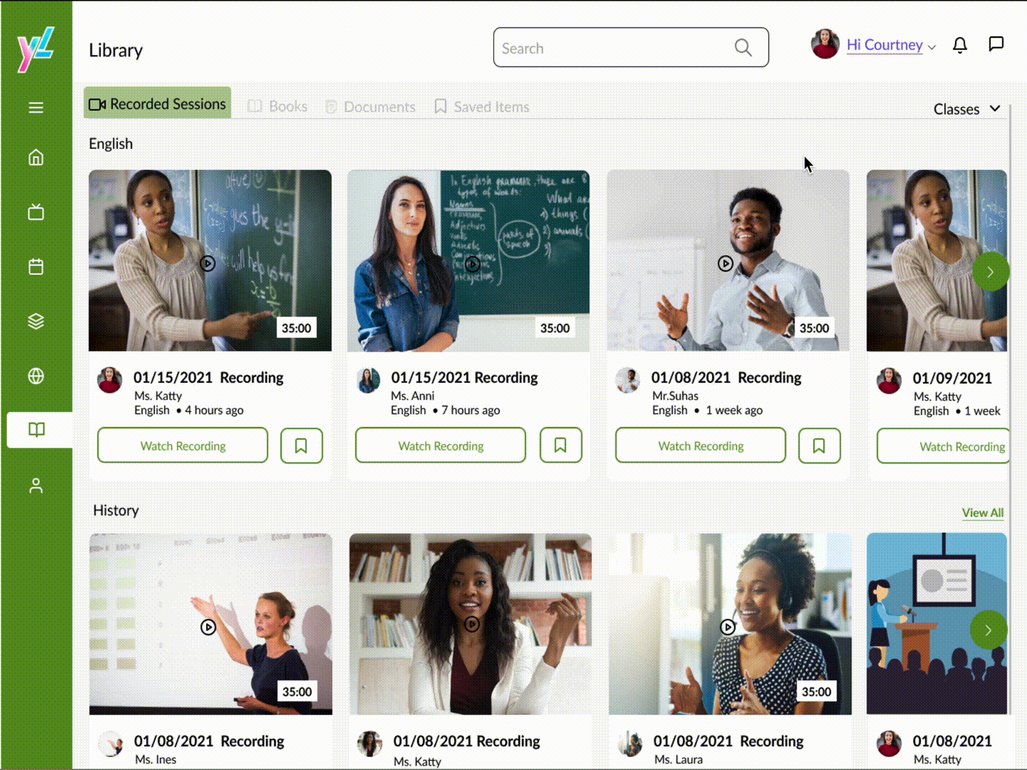
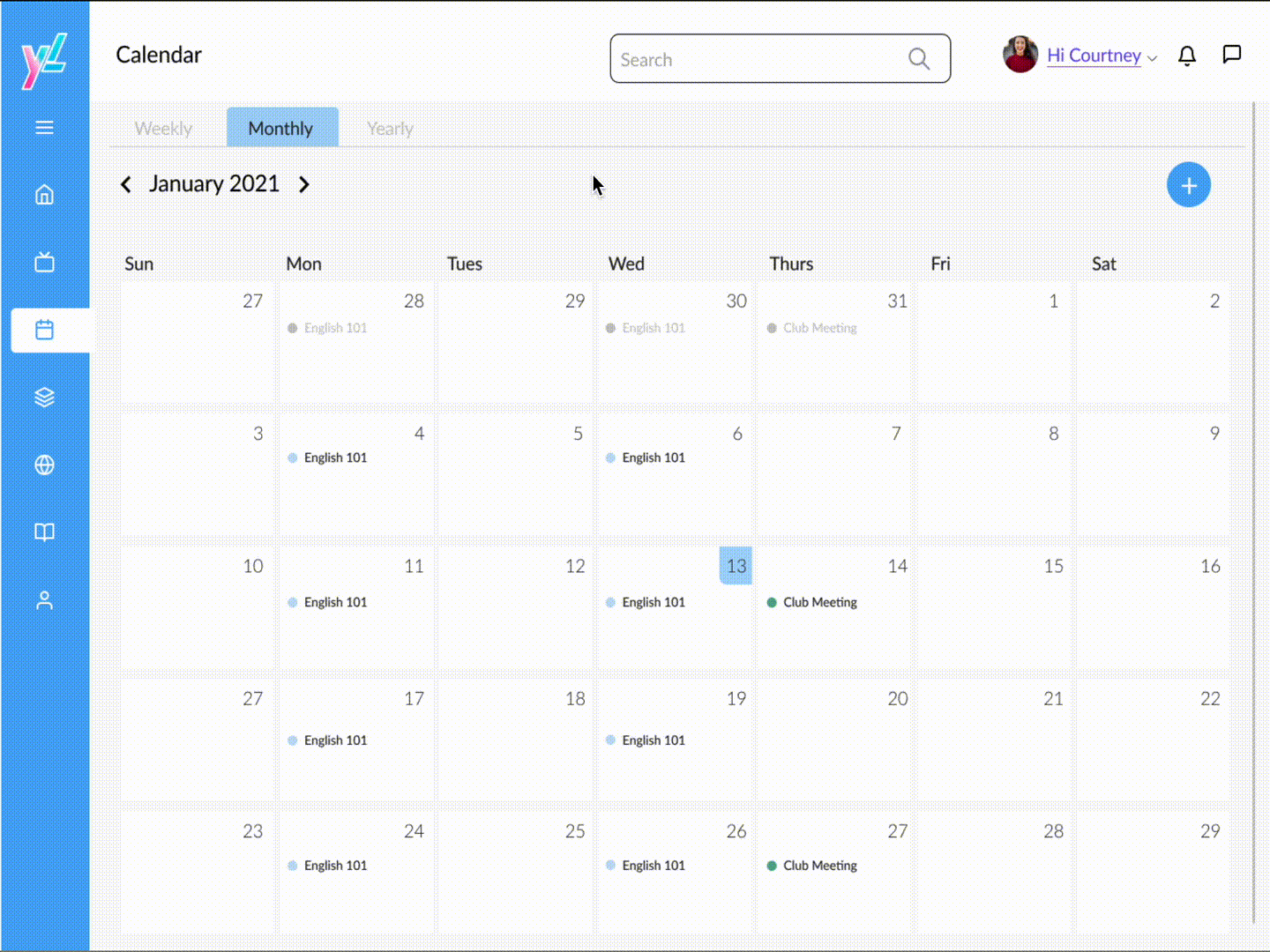
Check out our before and after designs! We didn't have time to design the Dashboard or Programs screens, so those don't transition :(

User Testing

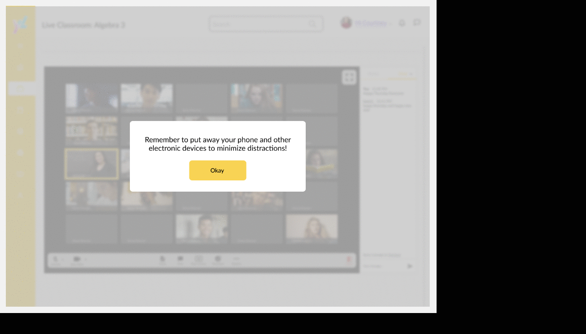
To evaluate the new platform on Y-Labs, we conducted a usability test with a current student. This allowed us to test what we designed before we left to see if it fit at least one user’s needs.

Our test user gave us great feedback on small changes that would have the most impact on their experience, such as limiting the amount of people in a chatroom in the Community page, and consolidating all classroom material (e.g. school-provided textbooks and student-purchased textbooks) into the Library page. Overall, the user enjoyed the platform!

“I really liked the features. I think having all the apps in one platform is a really good idea, and I would use [Y-Labs], especially right now.” - A.L.

Taking what information we had from that user, and looking back on our research, we made adjustments on our wireframes.

Final Adjustments

As we shared the information with the rest of the team, our finishing touch was aesthetic: improving the color palette.

Overall, we thought the monochromatic purple colors the previous designer had was bland and did not fit into the message Y-Labs was trying to convey: remote learning doesn’t have to be boring. So, we played around with the idea of a playful rainbow palette, where every page would have a different color to evoke different types of emotion.

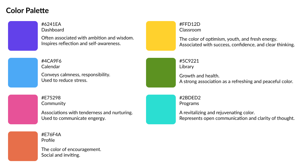
We presented this concept on our last day, which was met with mostly positive feedback. If we were to work on this project further, we would change the sidebar to a more neutral color to pull the platform together.

Because this platform has not been released yet, I am unable to host a public prototype.

Reflections

What did I learn?

Communication is key when working with a team. There was a lot of time we could have saved if we just reached out to each other before we began designing something, such as discussing the colors, to clear up confusion and minimize wasting time. In addition, we could only meet for about an hour a day due to all of our busy schedules, so setting a proper agenda would’ve helped to maximize each discussion.

Next steps?

Due to time constraints, I was only able to work with the Y-Labs Ventures team to make wireframes for the most crucial pages. The next steps are to formally establish the color palette, continue making wireframes for the rest of the pages, and test the design again, but this time with more users.

Although five weeks was not nearly enough to accomplish everything I had envisioned for this project, I am grateful that Springboard and Y-Labs gave me the opportunity to collaborate with other designers and share my ideas. It was exciting to build a product that could potentially help a lot of students feel more connected, especially in the midst of a pandemic.

Now, it’s in the hands of Y-Labs and their designers to continue the project. I can’t wait to see the final product!